How to dynamically plot variables with ggplot using plotter functions
Write plotting functions and dynamically access variables from a dataframe passed as a string argument with tidy evaluation and ggplot
The tidy Data Scientist
As a data scientist, having the right tools in your toolbox is a must, and this is one of them. Tidyverse and dplyr verbs allow us to write clean code with the use of tidy evaluation.
Tidy evaluation?
Tidy evaluation is a programming paradigm in the R programming language that allows for a more intuitive and efficient way of working with data. The basic idea behind tidy evaluation is to treat variables as expressions rather than symbols. This means that when you write R code, you can easily use variables that reference columns in a dataframe as if they were actual variables in your environment. This can make your code cleaner, more concise and more readable.
Another huge benefit is that we can leverage on the incredible dplyr package to create reusable functions, or helpers, that will make our life easier.
One way to accomplish this is by using the curly curly operator ({{}}) from the rlang package.
Let’s show a couple examples of this neat trick:
# Create a function that takes as arguments a data frame and two column names and returns a filtered data frame
my_filter <- function(df, var1, var2){
  result <- df %>%
    filter({{var1}} > {{var2}})
  return(result)
}
It also works with the rest of dplyr verbs:
# Create a function that calculate the grouped mean of a variable, passing both as argument
calculate_mean_by_group_var <- function(df, group_var, target_var){
  result <- df %>%
    group_by({{group_var}}) %>%
    summarise(mean = mean({{target_var}}))
  return(result)
}
It’s easy to see the wonders that can be achieved with this operator. By creating functions that wrap calls to dplyr functions while following tidy evaluation principles, we can create reusable code that is flexible, efficient, and easy to read.
Is it possible to use tidy evaluation with ggplot? Say yes!
It just works!! If you are going to create several plots it’s super useful to create wrappers around some of them to avoid repetitive typing.
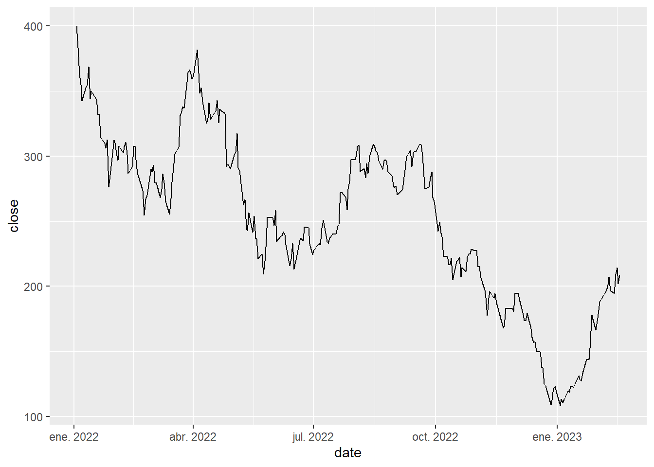
Let’s plot the closing stock price of TSLA to showcase its use:
## # A tibble: 6 × 6
##   date        open  high   low close    volume
##   <date>     <dbl> <dbl> <dbl> <dbl>     <dbl>
## 1 2022-01-03  383.  400.  379.  400. 104686047
## 2 2022-01-04  397.  403.  374.  383. 100248258
## 3 2022-01-05  382.  390.  360.  363.  80119797
## 4 2022-01-06  359   363.  340.  355.  90336474
## 5 2022-01-07  360.  360.  337.  342.  84164748
## 6 2022-01-10  333.  353.  327.  353.  91814877
my_plot <- function(df, var){
df %>%
ggplot(aes(x=date)) +
geom_line(aes(y={{var}}))
}
my_plot(tsla, close)
Easy peasy! Probably you are good to go with that example 90% of the times.
However, another use cases do exist. The main one I can think of is having the column you want to plot stored in another variable. Applying the same solution doesn’t work here.
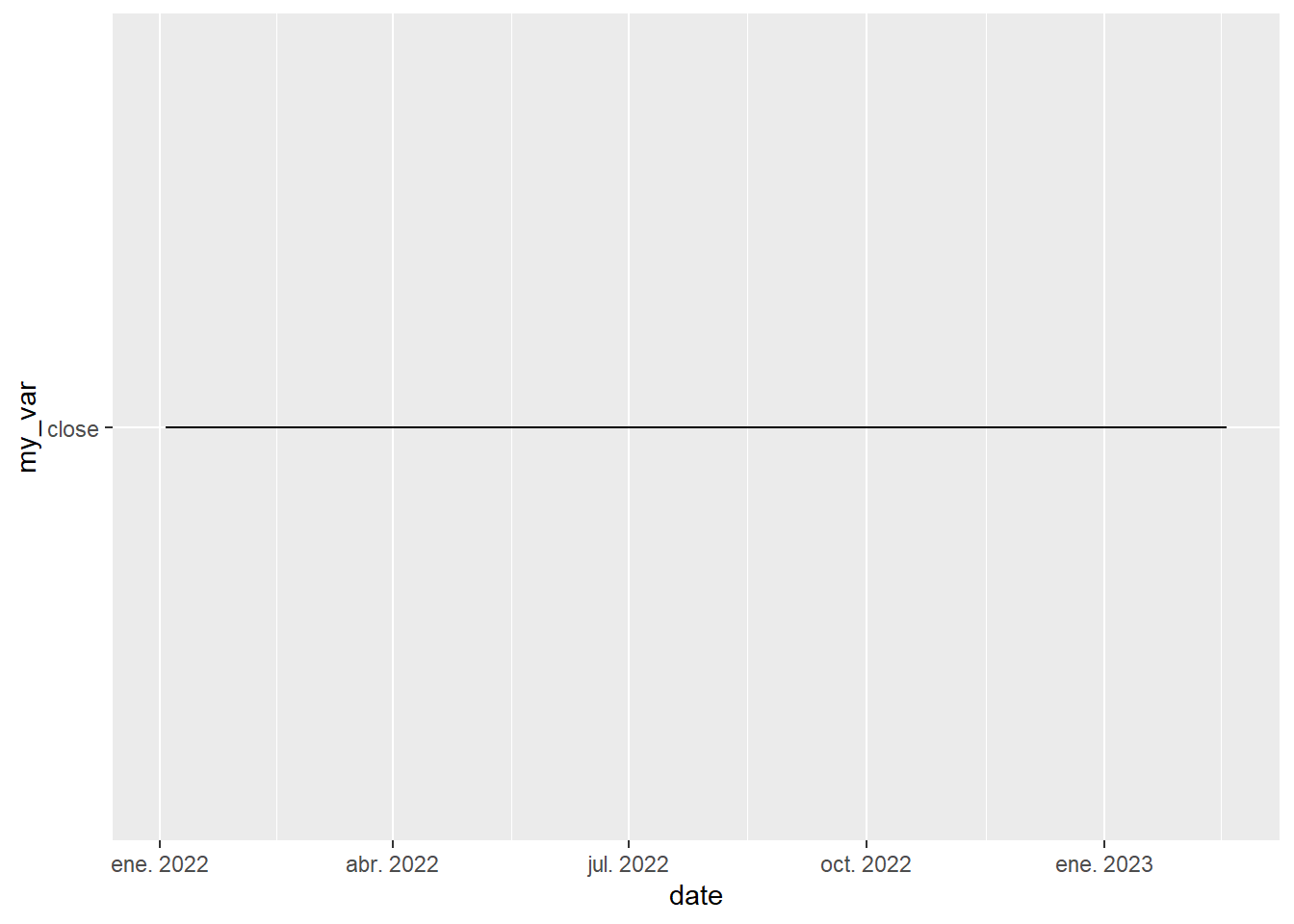
This doesn’t raise an error but it doesn’t produce the desired plot.
Some time ago, we would have solved this with aes_string instead of aes to map the variables, like this:
my_deprecated_plot <- function(df, var){
  df %>%
    ggplot(aes(x=date)) +
    geom_line(aes_string(y=my_var))
}

my_var <- "close"
my_deprecated_plot(tsla, my_var)
Whereas it does still work,
 aes_string has been deprecated so use it at your own risk.
The way we are suppose to overcome this is by using the helper .data inside the mapping call, which I must say it’s pretty neat:
There is another corner case that maybe we can face: Having to pass the variable as a character itself, instead of having it in a variable. It’s a silly example as we could simply store it in a variable before calling the plotter but it’s good to know different possibilities.
For this case, again we could simply use the .data helper shown in the previous example, but life would be boring if it was that easy.
Another (weird) way to solve this one is using more advanced and unusual dplyr functions like ensym and the unquote operator from rlang, also known as the curly-curly operator (!!):
my_plot3 <- function(df, var){
  df %>%
    ggplot(aes(x=date)) +
    geom_line(aes(y=!!ensym(var)))
}
my_plot3(tsla, "close")
Definitely the curly-curly operator is really handy when programming with R. I hope you learned something today!
Check out other tidyverse tricks:
Pablo Cánovas
Senior Data Scientist at Spotahome
Data Scientist, formerly physicist | Tidyverse believer, piping life | Hanging out at TypeThePipe