Analyzing data from COVID19 R package
Does reported deaths match actual deaths?
Introduction
The idea behind this post was to play and discover some of the info contained in the COVID19 R package which collects data across several governmental sources.This package is being developed by the Guidotti and Ardia from COVID19 Data Hub.
Later, I will add to the analysis the historical track record of deaths over last years for some european countries and try to address if deaths by COVID19 are being reported accurately. This data is collected in The Human Mortality Database.
Altough it may seem a bit overkill, it was such an intensive Tidyverse exercise that I decided to show pretty much all the code right here because that is what this post is about: I don’t intend to perform a really deep analysis but to show a kind of simple way to tackle this problem using R and the Tidyverse toolkit.
You might pick up a couple of tricks like the use of split_group() + map() to manipulate each group freely, using the {{}} (bang bang operator) to write programatic dplyr code, some custom plotting with plotly or the recently discovered package ggtext by @ClausWilke.
Playing with COVID19 package
Let’s start by loading data from COVID19 package with covid19 function. It contains lots of information, but I will keep things simple and work only with Country, Date, Population and Deaths variables.
covid_deaths <- covid19(verbose = FALSE) %>%
  ungroup() %>%
  mutate(Week = week(date)) %>%
  select(Country = id, Date = date, Week, Deaths = deaths, Population = population) %>%
  filter(Date < today() %>% add(days(-2))) %>%
  mutate(Deaths_by_1Mpop = round(Deaths/Population*1e6))
I wanted to focus mainly on the most populated countries of the world because some of them are among the most affected by the virus, so I created a function for that as I will use it more than once.
get_top_countries_df <- function(covid_deaths, top_by, top_n, since){
  covid_deaths %>%
    group_by(Date) %>%
    top_n(100, Population) %>%
    group_by(Country) %>%
    filter(Date == max(Date)) %>%
    ungroup() %>%
    top_n(top_n, {{top_by}}) %>%
    select(Country) %>%
    inner_join(covid_deaths, ., by = "Country") %>%
    filter(Date >= ymd(since))
}
Starting with a basic plot. You have already seen this one a thousand of times.
ggplotly(
  covid_deaths %>%
    get_top_countries_df(top_by = Deaths, top_n = 10, since = 20200301) %>%
    ggplot(aes(Date, Deaths, col = Country)) +
    geom_line(size = 1, show.legend = F) +
    labs(title = "Total deaths due to COVID-19",
         caption = "Source: covid19datahub.io") +
    theme_minimal() +
    theme_custom() +
    scale_color_tableau() +
    NULL
) %>%
  layout(legend = list(orientation = "h", y = 0),
         annotations = list(
           x = 1, y = 1.05, text = "Source: covid19datahub.io",
           showarrow = F, xref = 'paper', yref = 'paper', font = list(size = 10)
         )
  )
What about the countries most affected by the virus in deaths relative to the population? Pretty basic too.
ggplotly(
  covid_deaths %>%
    get_top_countries_df(top_by = Deaths_by_1Mpop, top_n = 10, since = 20200301) %>%
    select(-Deaths) %>%
    rename(Deaths = Deaths_by_1Mpop) %>%
    ggplot(aes(Date, Deaths, col = Country)) +
    geom_line(size = 1, show.legend = F) +
    labs(title = "Total deaths per million people",
         caption = "Source: covid19datahub.io") +
    theme_minimal() +
    theme_custom() +
    scale_color_tableau() +
    NULL
) %>%
  layout(legend = list(orientation = "h", y = 0),
         annotations = list(
           x = 1, y = 1.05, text = "Source: covid19datahub.io",
           showarrow = F, xref = 'paper', yref = 'paper', font = list(size = 10)
         )
  )
Now, the pandemic didn’t explode in each country at the same time. Because of the exponential nature of the problem, it is also useful to display the information relative to the day certain number of confirmed cases or deaths are reached. I will use a couple of functions for that:
get_date_since_ndeaths <- function(covid_deaths, since_var, first_n){

  covid_deaths %>%
    group_by(Country) %>%
    filter({{since_var}} >= first_n) %>%
    top_n(1, -{{since_var}}) %>%
    group_split() %>%
    map_dfr(~ .x %>% head(1)) %>%
    select(Country, Date_since_ndeaths = Date)
}

get_deaths_since_event <- function(covid_deaths, since_var, first_n){

  date_since_ndeaths <- get_date_since_ndeaths(covid_deaths, {{since_var}}, first_n)

  covid_deaths %>%
    group_by(Country) %>%
    filter({{since_var}} >= first_n) %>%
    ungroup() %>%
    left_join(date_since_ndeaths, by = "Country") %>%
    mutate(Days_since_ndeaths = difftime(Date, Date_since_ndeaths, units = "days") %>%
             as.integer()) %>%
    rename(Day = Days_since_ndeaths)
}
Here I’m showing in logarithmic scale the evolution of (cumulative) deaths since the first day 1 death per million people were counted:
ggplotly(
  covid_deaths %>%
    get_top_countries_df(top_by = Deaths_by_1Mpop, top_n = 10, since = 20200101) %>%
    get_deaths_since_event(since_var = Deaths_by_1Mpop, first_n = 1) %>%
    ggplot(aes(Day, Deaths_by_1Mpop, col = Country)) +
    geom_line(size = 1, show.legend = F) +
    scale_y_log10() +
    labs(title = "Total deaths per million people",
         subtitle = "X-axis counts days since 1 death by 1M pop for each country",
         caption = "Source: covid19datahub.io") +
    theme_minimal() +
    theme_custom() +
    scale_color_tableau() +
    NULL
) %>%
  layout(title =
           list(text = paste0('Total deaths per million people',
                              '<br>',
                              '<sup>',
                              'X-axis counts days since 1 death by 1M pop for each country',
                              '</sup>')),
         legend = list(orientation = "h", y = 0),
         annotations =
           list(x = 1, y = 1.05, text = "Source: covid19datahub.io",
                showarrow = F, xref = 'paper', yref = 'paper', font = list(size = 10)
           )
  )
It is also useful to look at the current trend: How is the evolution of the daily new deaths? Also, using a rolling average will smooth the lines and we will be able to see the patterns more clearly. Again defining the functions first:
get_rolling_deaths_since_event <- function(covid_deaths, since_var, first_n){

  date_since_ndeaths <- get_date_since_ndeaths(covid_deaths, {{since_var}}, first_n)

  covid_deaths %>%
    group_by(Country) %>%
    group_split() %>%
    map_dfr(
      ~ .x %>%
        mutate(
          Deaths_by_1Mpop_lag = lag({{since_var}}, 1),
          Daily_deaths_by_1Mpop = {{since_var}} - Deaths_by_1Mpop_lag,
          Daily_deaths_by_1Mpop_lag3 = lead(Daily_deaths_by_1Mpop, 3),
          SMA_daily_deaths_1M = forecast::ma(Daily_deaths_by_1Mpop_lag3, 7, centre = T) %>%
            as.vector(),
          SMA_daily_deaths_1M = dplyr::lag(SMA_daily_deaths_1M, 6))) %>%
    select(-Deaths_by_1Mpop_lag, -Daily_deaths_by_1Mpop_lag3) %>%
    filter({{since_var}} >= first_n) %>%
    ungroup() %>%
    inner_join(date_since_ndeaths, by = "Country") %>%
    mutate(Days_since_ndeaths = difftime(Date, Date_since_ndeaths, units = "days") %>%
             as.integer())
}

get_top_countries_when_var_max <- function(covid_deaths, top_by, top_n){
  covid_deaths %>%
    group_by(Country) %>%
    filter({{top_by}} == max({{top_by}})) %>%
    group_split() %>%
    map_dfr(~ .x %>% head(1)) %>%
    ungroup() %>%
    top_n(top_n, {{top_by}}) %>%
    select(Country) %>%
    mutate(Top_country = TRUE)
}
I’m showing here the smoothed daily deaths per million population to have a better sense of the pandemic current state in each country.
ggplotly(
  covid_deaths %>%
    get_top_countries_df(top_by = Deaths_by_1Mpop, top_n = 100, since = 20200101) %>%
    get_rolling_deaths_since_event(Deaths_by_1Mpop, 1) %>%
    left_join(get_top_countries_when_var_max(., SMA_daily_deaths_1M, 10), by = "Country") %>%
    mutate(Top_country = if_else(is.na(Top_country), FALSE, TRUE),
           CountryLabel = if_else(Top_country, Country, NA_character_)) %>%
    select(-Deaths) %>%
    rename(Day = Days_since_ndeaths,
           Deaths = SMA_daily_deaths_1M) %>%
    mutate(Deaths = round(Deaths, 2)) %>%
    ggplot() +
    geom_line(data = . %>% filter(Top_country), aes(Day, Deaths, col = CountryLabel),
              size = 1) +
    geom_line(data = . %>% filter(!Top_country), aes(Day, Deaths, group = Country),
              col = "grey", alpha = .5) +
    labs(title = "Seven-day moving average daily deaths",
         subtitle = "X-axis counts days since 1 death by 1M pop for each country",
         caption = "Source: covid19datahub.io") +
    theme_minimal() +
    theme_custom() +
    scale_color_tableau() +
    NULL
) %>%
  layout(title =
           list(text = paste0('Seven-day moving average daily deaths',
                              '<br>',
                              '<sup>',
                              'X-axis counts days since 1 death by 1M pop for each country',
                              '</sup>')
           ),
         legend = list(orientation = "h", y = 0),
         annotations = list(
           x = 1, y = 1.05, text = "Source: covid19datahub.io",
           showarrow = F, xref = 'paper', yref = 'paper', font = list(size = 10)
         )
  )
Looking into the Human Mortality Database
Now we will add to the analysis the track record of deaths from last years for some european countries. I’m trying to calibrate if reported deaths due to COVID match real deaths data.
deaths <- mortality %>%
  rename(Deaths = DTotal) %>%
  filter(Sex == "b") %>%
  select(CountryCode, Year, Week, Deaths) %>%
  mutate(CountryCode = recode(CountryCode,
                              "DEUTNP" = "DEU",
                              "GBRTENW" = "GBR"),
         Country = recode(CountryCode,
                          "AUT" = "Austria",
                          "BEL" = "Belgium",
                          "DNK" = "Denmark",
                          "ESP" = "Spain",
                          "GBR" = "Great Britain",
                          "DEU" = "Germany",
                          "NLD" = "Netherlands",
                          "PRT" = "Portugal",
                          "SWE" = "Sweden")) %>%
  filter(!CountryCode %in% c("FIN", "NOR", "USA", "ISL", "BGR", "CZE"))

mean_deaths <- deaths %>%
  filter(Year != 2020) %>%
  group_by(Country, Week) %>%
  summarise(Mean_deaths = Deaths %>% mean() %>% round()) %>%
  ungroup()

deaths2 <- deaths %>%
  left_join(mean_deaths, by = c("Country", "Week")) %>%
  mutate(Excess_deaths = Deaths - Mean_deaths)
This is the weekly evolution of deaths over the past few years, being highlighted in orange the actual deaths in 2020.
deaths2 %>%
  ggplot() +
  geom_line(aes(Week, Deaths, group = Year), col = "lightblue", alpha = .75) +
  geom_line(aes(Week, Mean_deaths), col = "steelblue", size = .75, alpha = .8) +
  geom_line(data = . %>% filter(Year == 2020), aes(Week, Deaths), col = "darkorange",
            size = 1.1) +
  facet_wrap(~Country, scales = "free") +
  labs(caption = "Source: The Human Mortality Database",
       title = "Weekly deaths <b style = 'color:darkorange'>in 2020</b> vs
                <span style = 'color:steelblue'>past years</span> and
                <b style = 'color:steelblue'>their mean</b>") +
  theme_minimal() +
  theme(strip.text = element_text(size = 12, face = "bold"),
        axis.title.x = element_text(size = 12),
        axis.title.y = element_blank(),
        panel.grid = element_blank(),
        plot.title = ggtext::element_markdown(size = 16)
  ) +
  NULL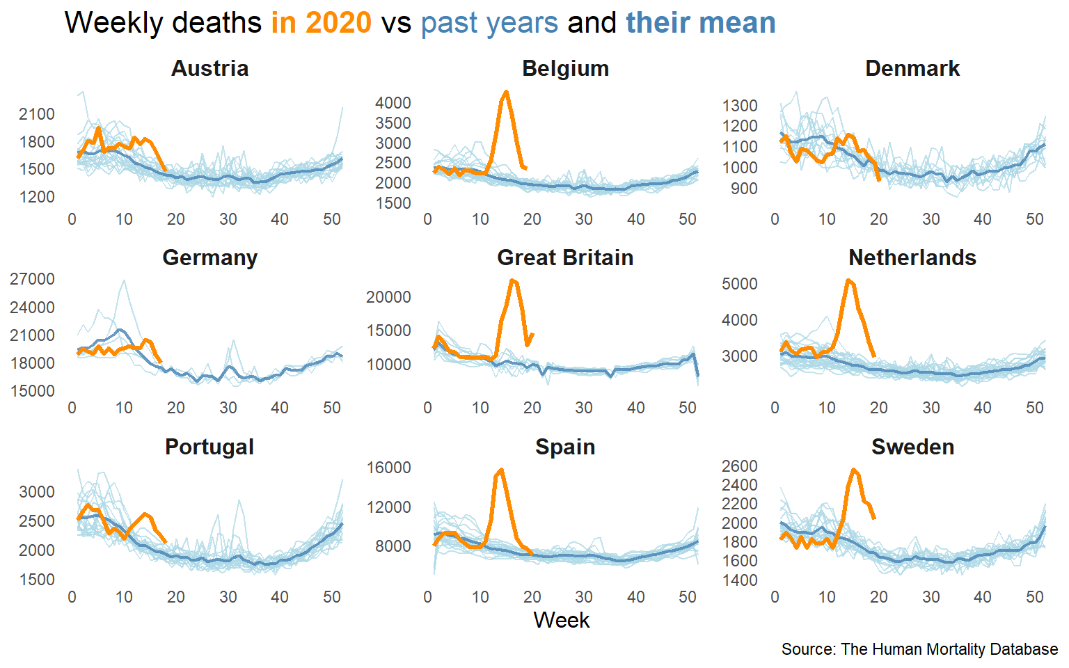
To calculate the excess ratio, comparing the cumulative deaths from this and previous years is needed.
deaths3 <- deaths2 %>%
  filter(Year == 2020, Week >= 9, Excess_deaths >= 0) %>%
  group_by(Country) %>%
  mutate(Cum_mean_deaths = cumsum(Mean_deaths),
         Cum_excess_deaths = cumsum(Excess_deaths),
         Max_week = max(Week),
         Max_excess_deaths = max(Excess_deaths)) %>%
  top_n(1, Week) %>%
  mutate(ExcessRatio = round(100*Cum_excess_deaths/Cum_mean_deaths, 1)) %>%
  select(Country, Year, Week, ExcessRatio, Max_week, Max_excess_deaths) %>%
  left_join(deaths2, ., by = c("Year", "Week", "Country"))


covid_weekly_deaths <- covid_deaths %>%
  rename(Cum_deaths = Deaths) %>%
  filter(Country %in% c("AUT", "BEL", "DNK", "DEU", "GBR", "NLD", "PRT", "ESP", "SWE")) %>%
  group_by(Country) %>%
  mutate(Cum_deaths_lag = lag(Cum_deaths, 1),
         Deaths = Cum_deaths - Cum_deaths_lag) %>%
  group_by(Country, Week) %>%
  summarise(Covid_deaths = sum(Deaths)) %>%
  ungroup() %>%
  na.omit() %>%
  rename(CountryCode = Country) %>%
  mutate(Year = 2020)

deaths4 <- deaths3 %>%
  left_join(covid_weekly_deaths, by = c("CountryCode", "Year", "Week"))
Lastly, I will plot the excess of deaths of this year compared to the mean of previous years and to the official COVID deaths.
deaths4 %>%
  ggplot() +
  geom_line(aes(Week, Excess_deaths, group = Year), col = "lightblue", alpha = .75) +
  geom_line(data = . %>% filter(Year == 2020), aes(Week, Excess_deaths),
            col = "darkorange", size = 1) +
  geom_line(data = . %>% filter(Year == 2020), aes(Week, Covid_deaths),
            col = "red", size = 1, na.rm = T) +
  geom_area(data = . %>% filter(Year == 2020, Week >= 9, Excess_deaths > 0),
            aes(Week, Excess_deaths),
            fill = "darkorange", size = 1, alpha = .15) +
  geom_hline(yintercept = 0, size = 0.75, col = "steelblue") +
  geom_label(aes(Max_week+9, exp(log(Max_excess_deaths)/1.1),
                 label = paste0("+", ExcessRatio, "%")),
             color = "darkorange", na.rm = T, fontface = "bold", size = 3.5, alpha = .5) +
  facet_wrap(~Country, scales = "free") +
  labs(title = "<b style = 'color:darkorange'>Excess</b> deaths vs
                <b style = 'color:red'>reported COVID</b> deaths",
       subtitle = "<b style = 'color:darkorange'>Ratio</b> shows death increase
                    respect to last years average",
       caption = "**Source:**
                <b style = 'color:steelblue'>The Human Mortality Database</b> **&**
                <b style = 'color:red'>COVID-19 Data Hub</b>") +
  theme_minimal() +
  theme(strip.text = element_text(size = 11, face = "bold"),
        axis.title.x = element_text(size = 12),
        axis.title.y = element_blank(),
        panel.grid = element_blank(),
        plot.title = ggtext::element_markdown(size = 16),
        plot.subtitle = ggtext::element_markdown(size = 11),
        plot.caption = ggtext::element_markdown(size = 8),
  ) +
  NULL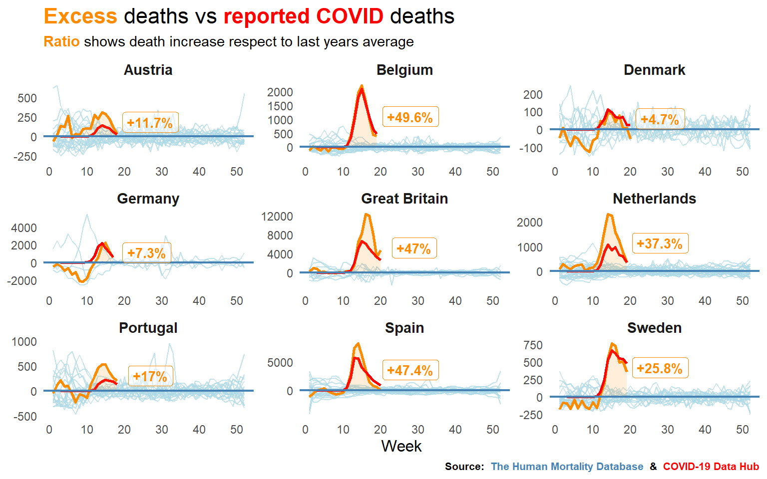
It seems like certain countries are having some trouble with the reports, doesn’t it? For the next take, I’ll try to get fresh data from more countries, including some non european ones, to see how are dealing with numbers in Asia and America.
And that’s all for now folks!
Pablo Cánovas
Senior Data Scientist at Spotahome
Data Scientist, formerly physicist | Tidyverse believer, piping life | Hanging out at TypeThePipe