Shadowing your ggplot2 lines. Forecasting confidence interval in R use case.
Plot your confidence interval easily with R! With ggplot2 geom_ribbon() function you can add shadowed areas to your lines. We show you how to deal with it!
Exploring the Versatility of ggplot2 and geom_ribbon() in Data Visualization
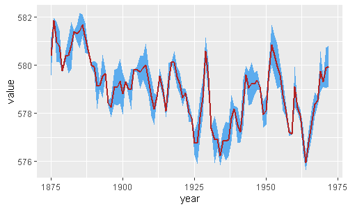
Yesterday I was asked to easily plot confidence intervals at ggplot2 chart. Then I came up with this shadowing ggplot2 feature called geom_ribbon().
It’s not a trivial issue as long as you need to gather your data in order to achieve a tidy format. When you already have this data frame, all you need is geom_ribbon().
By using the following commented code you are able to show not only your point estimated forecast but also its confidence or prediction intervals.
library(tidyverse)
huron <- data.frame(year = 1875:1972,
                    value = LakeHuron,
                    std = runif(length(LakeHuron),0,1))

huron %>%
  ggplot(aes(year, value)) +
  geom_ribbon(aes(ymin = value - std,
                  ymax = value + std),    # shadowing cnf intervals
              fill = "steelblue2") +
  geom_line(color = "firebrick",
            size = 1)                     # point estimate
Ggplot geom_ribbon for multiple lines
With just a few lines of code, you can create these stunning multiple line plots that make your data come to life. Whether you’re tracking stock prices over time, visualizing weather patterns… one’d like to add to a multiple line ggplot chart a confidence intervals bands.
To add variance bands for your multiple line ggplot graph, you should include the colour and group aesthetic as follows:
library(tidyverse)
huron <- data.frame(year = rep(1875:1972,2),
                    group = c(rep("a",98),rep("b",98)),
                    value = c(LakeHuron, LakeHuron + 5),
                    std = runif(length(LakeHuron)*2,0,1))

huron %>%
  ggplot(aes(year, value, fill = group)) +
  geom_ribbon(aes(ymin = value - std,
                  ymax = value + std,
                  group=group),
              fill = "steelblue2") +
  geom_line(color = "firebrick", size = 1)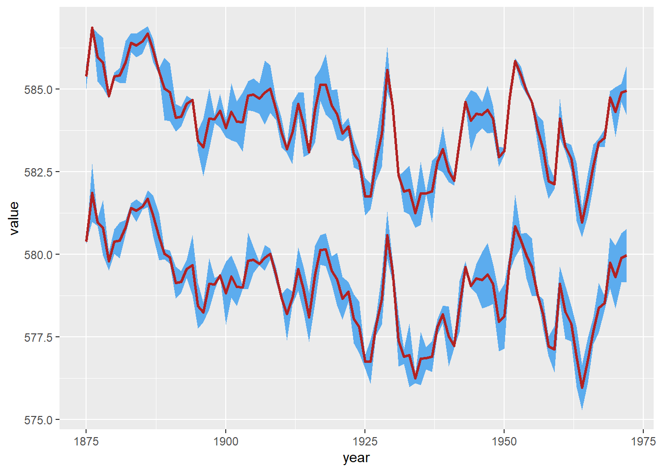
You can shade in those confidence intervals, highlight uncertainty, and add that extra pop to your plots. It’s seriously the secret weapon to take your data viz game up a notch. So, if you haven’t unleashed the power of geom_ribbon() with ggplot yet, you’re missing out on some seriously cool data-plotting adventures. Trust me, your charts are about to get a whole lot more exciting! 🚀
You can see related R visualizations and tips on TypeThePipe
Carlos Vecina
Senior Data Scientist at Jobandtalent
Senior Data Scientist at Jobandtalent | AI & Data Science for Business