Plot your GIS data with GeoPandas and Plotnine. A single glance insightful visualization
Learn how to use GeoPandas and Plotnine to create high impact and insightful visualization with Python.

Geographical Data Visualization in Python with GeoPandas
Working with geographical data can often be a bit tricky for the uninitiated. This post aims to shed some light for those who are encountering geo data for the first time and want an easy way to perform initial manipulations and plot it to gain their first insights.
We’re about to dive into a sea of coordinates, shapes, and a whole lot of mapping magic!
GIS data formats
First of all, we want to make a summary about the most used data formats for geo data. These are the unsung heroes in the world of mapping and spatial analysis. Imagine trying to describe the vastness of our planet without them – it’s like trying to paint a masterpiece with just one color. Not happening, right?
First up in our parade of geo data superstars are formats like Shapefile (SHP), the old faithful of the geo world. But you’ll need a complete set of three files that are mandatory to make up a shapefile. The three required files are: .SHP for geometry, .SHX is the shape index position and .DBF is the attribute data.
Developed by ESRI, it’s like the trusty old pickup truck – not the flashiest but gets the job done. Then there’s GeoJSON, the cool kid on the block. It’s all about simplicity and web-friendliness, perfect for those who love to mingle with JavaScript and web mapping.
And let’s not forget about KML (Keyhole Markup Language), the go-to for Google Earth enthusiasts. It’s like having a GPS in your pocket – straightforward and ready to guide you through those virtual globetrotting adventures. Each of these formats has its own quirks and charms, kind of like different types of pasta – some are better suited for hearty meaty sauces, while others are perfect for a light seafood affair.
In short, the world of geo data formats is as diverse and colorful as the world it represents. Whether you’re a GIS guru or a casual map enthusiast, getting to know these formats is like getting the keys to a whole new world of spatial wonders
Yuo can check more info here!
Load SHAP data into Python object
Let’s kick things off by accessing the geo data and geometries. Imagine we are a company with central stations spread across the Spanish territory, responsible for the alerts in their vicinity. Each station acts as a sentinel, vigilantly monitoring and responding to the events unfolding around it. So we will begin with defining the country over which we’re planning to plot the stations and event coordinates.
Now, here comes the fun part: we load the Shape data using GeoPandas. It’s like unlocking a treasure chest of geographical wonders! GeoPandas makes it a breeze, turning what could be a complex task into a walk in the park. Imagine GeoPandas as your trusty GPS, guiding you through the intricate world of geo data with ease and precision. So, grab your data, let’s fire up GeoPandas, and watch as those lines of code magically transform into a map full of possibilities!
import geopandas as gp
import pandas as pd

def filter_shp_peninsular_data(df: pd.DataFrame) -> pd.DataFrame:
    return df[df["acom_name"] != "Canarias"]

spain_gis_map = gp.read_file('./data/georef-spain-provincia/georef-spain-provincia-millesime.shp')
peninsular_gis_map = filter_shp_peninsular_data(spain_gis_map)
We can filter out any layer in the GeoPandas read_file function with the bbox and mask parameters. But let’s keep it simple for the moment and just load and filter out it.
For ease of use, we are going to load and filter also the alerts peninsular data. You can easily apply coordinates filters in order to focus in one specific geography. We will transform our internal data read with Polars to GeoPandas dataframe to show how it could be do, but it is not strictly necessary.
from shapely.geometry import Point
import polars as pl
def filter_df_peninsular_data(df: pd.DataFrame) -> pd.DataFrame:
peninsular_bounds_min = peninsular_gis_map["geometry"].bounds.min()
peninsular_bounds_max = peninsular_gis_map["geometry"].bounds.max()
return df.filter(
(
pl.col("x")>=peninsular_bounds_min["minx"]
) & (
pl.col("x")<=peninsular_bounds_max["maxx"]
) & (
pl.col("y")>=peninsular_bounds_min["miny"]
) & (
pl.col("y")<=peninsular_bounds_max["maxy"]
)
)
alerts_geo_df = pl.read_csv("alers_data.csv")
alerts_geo_df = gp.GeoDataFrame({
"geometry": alerts_geo_df["coord"].map_elements(lambda x: Point(x)),
"alert_solved": alerts_geo_df["alert_solved"].is_not_null(),
"x": alerts_geo_df["x"],
"y": alerts_geo_df["y"],
})
stations_geo_df = pl.read_csv("stations_data.csv")
stations_geo_df = gp.GeoDataFrame({
"geometry": stations_geo_df["coord"].map_elements(lambda x: Point(x)),
"x": stations_geo_df["x"],
"y": stations_geo_df["y"],
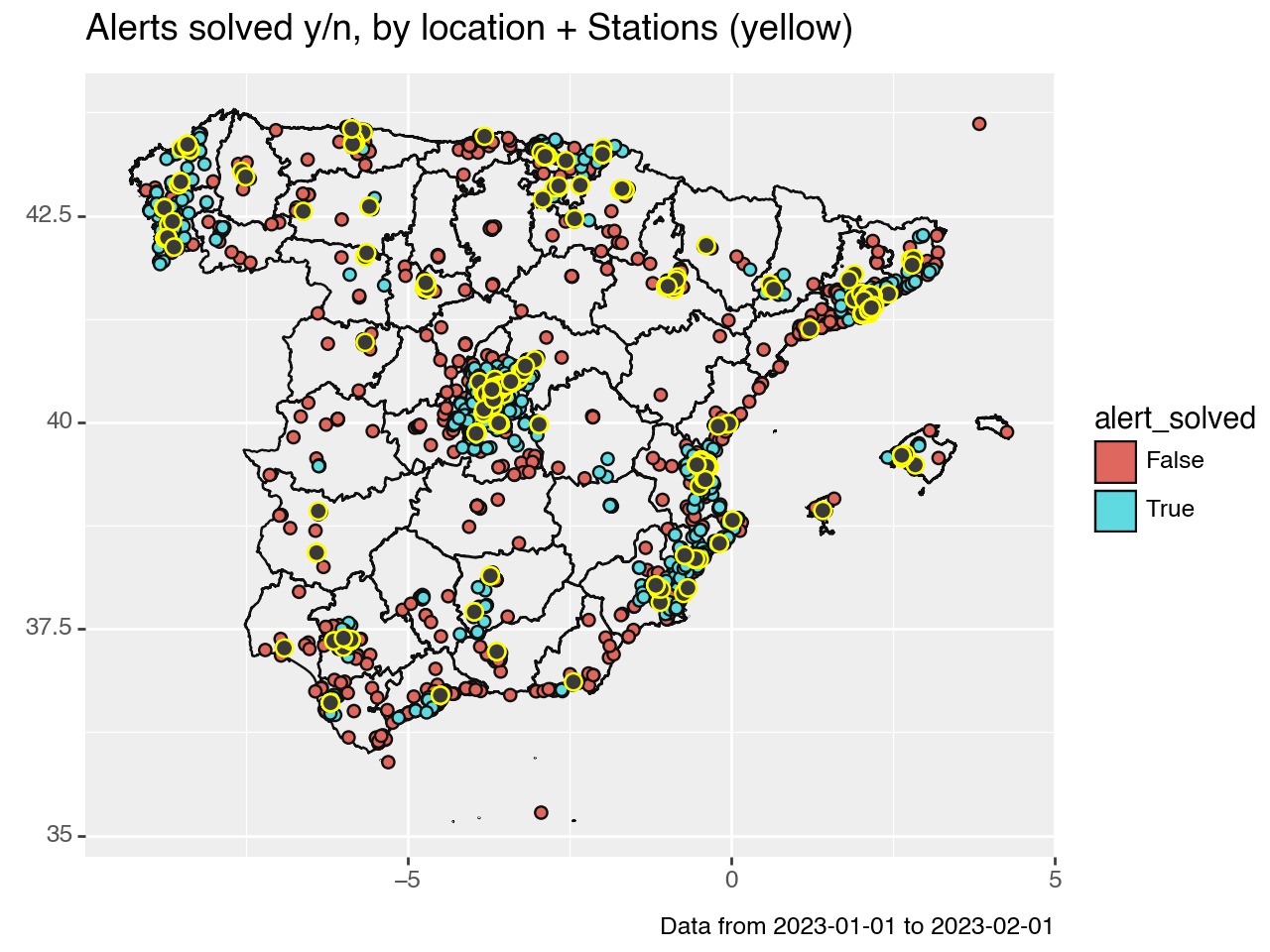
})Geopandas plotting with Plotnine
Let’s start with our mission to plot a map sprinkled with stations (in cheerful yellow) and events (in bold red and blue).
Once we have the data both country layers and our project datapoints properly formated as GeoPandas DataFrames
The geom_map function is our stroke of genius, turning geographical data into visual narratives.
(
    ggplot()
    + geom_map(peninsular_gis_map, fill=None)
    + geom_map(alerts_geo_df, aes(fill="alert_solved"), size=2)
    + geom_map(stations_geo_df, colour="yellow", size=3)
    + labs(
        title="Alerts solved y/n, by location + Stations (yellow)",
        caption = "Data from  2023-01-01 to 2023-02-01",
    )
)
Geopandas plotting the most representative category by location
Now, we’re not just mapping points; we’re painting a picture of the most representative category by location. Think of it as a data detective story, where each clue (or data point) reveals a part of the bigger picture.
Here’s how we crack the case:
(
    ggplot()
    + geom_bin2d(alerts_geo_df, aes(x="x", y="y", fill="alert_solved"), bins = 30)
    + geom_map(stations_geo_df, colour="yellow", size=3)
    + labs(
        title="Alerts solved y/n, by location + Stations (yellow)",
        caption = "Data from  2023-01-01 to 2023-02-01",
    )
)![]()
With geom_bin2d, we’re transforming our map into a vibrant tapestry, showcasing the most contacted categories in a kaleidoscope of colors. Each square on this grid is like a pixel, together weaving the story of our data’s journey across the Spanish landscape. And, of course, our stations, marked in sunny yellow, stand out as beacons in this sea of information.
Stay updated on Python tips
Hopefully, this post has helped familiarize you with GeoPandas, GIS data nd Plotnine in Python.
If you want to stay updated…
Carlos Vecina
Senior Data Scientist at Jobandtalent
Senior Data Scientist at Jobandtalent | AI & Data Science for Business