Turn your GGplot to 3D animation. Awesome 2D to 3D plots in R with Rayshader
Do you want to add a 3rd dimension to your R plot? In this post we show you how to turn your R ggplot to a 3D plot easily with Rayshader.

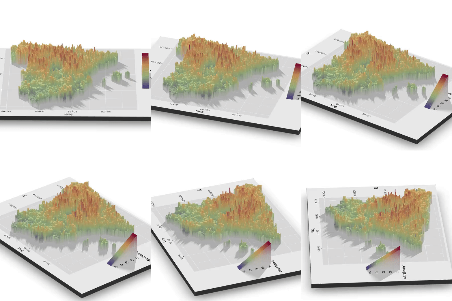
In 7 minutes reading, You will learn how to turn your ggplot visualizations into amazing interactive 3D plots you can export or embed in HTML/Rmarkdown. Or even better, you will export as mp4 an animation rotating the figure.
As a use case, we are going to join the Spanish demographic data and GIS map, and then visualize it

1. Introduction
During the last weeks a ‘new’ package has received the R community attention. We say ‘new’ because it joined recently the CRAN, althought the very first commits in github repo date back more than a year. Its name is rayshader and in the author’s own words:
“rayshader uses elevation data in a base R matrix and a combination of raytracing, spherical texture mapping, overlays, and ambient occlusion to generate beautiful topographic 2D and 3D maps”
In my view, Tyler Morgan-Wall (package’s author) hit the jackpot with the new addition of two specific functions. These are plot_gg() and render_movie(). The first one converts the ggplot to a 3D figure using one or two lines of code making it deadly-simple. The second one renders an animation in which we can set up several parameters like zoom, fps, angles and inclinations… as user-friendly as possible.

Let’s try these new functionalities!
The only condition you must have a color or fill aesthetic, unless you can also play in the same plot wiht size. Many times 3D plots are not the right choice for most of the data visualization cases. Therefore, I tried to bring to this article a non gratuitous example.
As a practical challenge, we will visualize in an interactive 3D map the average age in each city of Spain. Cool? First of all we need the population stats. We get it from the INE webpage. Secondly we have to delimiter Spanish cities with they GIS coordinates. Then we are merging these data to create a ggplot chart. Once we have the ggplot object we are going to use the rayshader package to map color aesthetic to the third spatial dimension. To conclude, we are going to render it as rotating 3D video.
Let´s do it step by step.
2. Visualazing Spanish cities average age.
We usually want to start our pratical work drawing the main steps in our project and our principal goals. So in a general layer, we want to visualiza the average age. Firstly in a ggplot-color way, go one step further and make the plot 3D and end with an animation where the Z axis will be the average age.
2.1- Downloading census data
As said, for our purpose, we need to collect data from two sources. We use INE open data portal to download census ages data by city. After a not very user-friendly search, we got it. I provide you the following link, where you can find the continuous register statistics: link.
Aiming to keep focused, we don’t get distracted and we are going to download the 2018 file. However, is worth noting the INEbase efforts to make easier the INE open data platform.
We start loading (or downloading) the packages we are going to use. In other article or tip we will provide a custom function to Load and Download Rpackages in onle line. Moreover we define the required functions and download directories.
library(pxR)
library(RColorBrewer)
library(rgeos)
#install.packages("rgdal", repos = "http://cran.us.r-project.org") reinstall cause gpclib dependencie https://stackoverflow.com/questions/30790036/error-istruegpclibpermitstatus-is-not-true
library(rgdal)
library(rayshader)
library(knitr)
library(magrittr)
library(tidyverse)

as.numeric.factor <- function(x) {    # Custom function to convert fctr to num factor value
    return(suppressWarnings(as.numeric(levels(x))[x]))
}

if(!dir.exists("data")) dir.create("data")  # Create the download directory
Downloading INE 2018 file:
utils::download.file(url = "http://www.ine.es/pcaxisdl/t20/e245/p05/a2018/l0/00000006.px",
destfile = "data/census_2018.px")We parse the data to obtain a name,pcode,average age dataframe
tbl_census_2018 %<>%
  set_names(c("age", "city", "sex", "population")) %>%             # Cambiamos los nombre
  na.omit() %>%                                                    # Na rmv
  filter((city!="Total")&(age!="Total")&(sex=="Ambos sexos")) %>%  # Duplicate info rmv
  separate(city, c('postal_code', 'city_name'), sep="-") %>%       # Sep City column
  mutate(age = as.numeric.factor(age)) %>%                         # Conv to numeric
  group_by(city_name, postal_code) %>%                             # Group to operate
  summarise(avg_age = sum(population*age,na.rm = T)/sum(population,na.rm=T)) %>%  # Avg age
  select(city_name, postal_code, avg_age)                          # Discard columns
2.2- Downloading GIS data
The second source we are going to use is the Geo data. We will use cities coordinates and matching it with Spanish demographic data previously obtained.
Downloading map overlay:
temp <- tempfile()                              # Create the tempfile
u="http://www.arcgis.com/sharing/rest/content/items/8e31c4c1a0b348f79058f212d0d807a1/data"
utils::download.file(url = u, destfile = temp,
                     mode="wb")                 # Binary mode for correct download

unzip(temp, exdir = "data/cities_gis")          # Unzip in data/cities_gis
unlink(temp)                                    # Delete temp file
We parse the spatial information to convert it into tabular data. We expect that the Canary Islands coordinates will skew the plot, so it’s our decision to keep focused in our 3D objetive and filter peninsular coordinates. It’s also possible, and a better practice, to move insular coordinates looking for a compact plot, instead of filter them out.
To complete this data processing, we use fortify function that allows us to don’t load more packages. However, this function throws a warning suggesting the broom::tidy() one.
tlb_cities_gis <- readOGR(dsn = "./data/cities_gis/Municipios_ETRS89_30N.shp",
                              verbose=FALSE) # Spatial data reading
tlb_cities_gis %<>%
fortify(region = "Codigo") # %>% # Conv "spatial object" to data.frame
# broom::tidy()
plot_canarias <- F # Control param, initial app config
if(plot_canarias==F){ # Should be moduled in a funct
tlb_cities_gis %<>%
filter((long>0) & (lat>4000000)) # Filter peninsular data
} Finaly, we join both creating the final dataset, which we are going to use to make the plots. Note that we use left join to keep de geo data.
As a good practice, we are going to check the number of NAs generated after the left join. These NAs meaning is that there are cities localized but without average year information
We can see that these missing values represents just 1% of the data, so we are going to impute them with the previous postal code info. I bet that you can easily improve this procedure but I consider it’s prety acceptable enought seeing the low NA ratio.
  tbl_cities_avg_age %>%
    group_by(id) %>%
    summarise(na = sum(is.na(avg_age))) %>%                 # NAs by city
    summarise(missing_perc = sum(na>0)/length(na)*100) %>%  # Perc cities with at least 1 na
    select(missing_perc)


tbl_cities_avg_age %<>%
  arrange(id) %>%
  fill(avg_age, .direction = "down")            # Fill with the previous pc data.
2.3- GGplot visualization
Inspired in http://blog.manugarri.com/making-a-beautiful-map-of-spain-in-ggplot2/
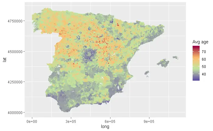
Once we have created the final dataset, we are able to start ploting it. Of course longitude in X-axis and latitude en Y-axis. Firstly average city age is represented using a color palette. Red colours are assigned to older people and blue ones to younger city population. We get it in ggplot with the fill aesthetic.
myPalette <- colorRampPalette(rev(brewer.pal(11, "Spectral")))      # Create reverse Spectral palette

plot_cities <- ggplot() +
  geom_polygon(data = tbl_cities_avg_age, aes(fill = avg_age,
                                         x = long,
                                         y = lat,
                                         group = id)) +      # Dummy variable to correct fill by PCode.
  scale_fill_gradientn(colours=myPalette(4)) +                 # Choose palette colours.
  labs(fill="Avg age")
plot(plot_cities)
2.4- 3D Rayshader Visualization!
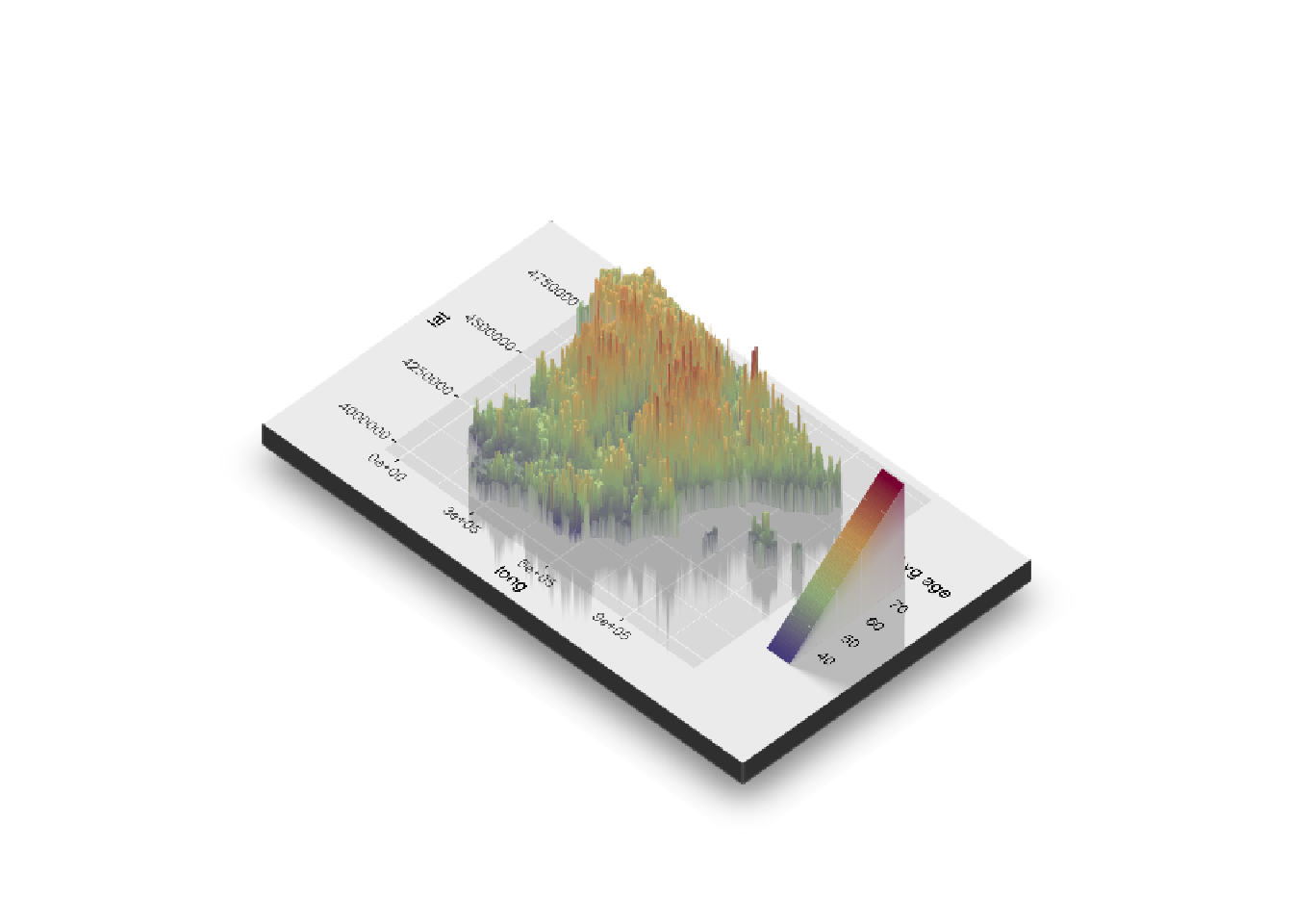
That was pretty nice. It’s sure that you can reach the general propose to be able to locate inmediately older an younger zones. Although as we will disccuss in a future post, human eyes aren’t ready to distinguiss almost nothing but big color contrasts. What about complement color with a third dimension through z axis?
Let’s see how it works
plot_gg(plot_cities,multicore=TRUE,width=5,height=3,scale=310)    # Plot_gg de rayshader
render_snapshot(filename = "3D_spain")
Hmm you told something about render_movie()… What if we anime it?
2.5- 3D animation with rayshader
In the last plot, it results the correct angle election as a key point. But what if we animate it with a rotating effect?
This is what the following function take cares on:
This way you can achieve the header 3D rotating image!
You can see related posts on TypeThePipe