Skills chart using Gplot2 with R
Do you want to include a skills chart to your Data Scientist CV? We shoy you how to achieve it with a few line of R code and ggplot!
In this TypeThePipe tip we are bringing you a skills plot template using R and ggplot2. Maybe its a good idea to evolve this plot and add an unique skill plot to your CV. And it’s only a few lines of R code!
You can see the code below :)
library(ggplot2)
# library(plotly)
library(tibble)
library(dplyr)
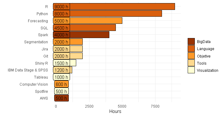
skills <- tribble(
~ Skill, ~ Hours, ~ Class,
"AWS", 500, "BigData",
"Python", 8000, "Language",
"Spark", 4000, "BigData",
"R", 9000, "Language",
"Git", 2000, "Tools",
"Jira", 2000, "Tools",
"Forecasting", 5000, "Objetive",
"Segmentation", 2000, "Objetive",
"Computer Vision", 600, "Objetive",
"SQL", 4500, "Language",
"IBM Data Stage & SPSS", 1200, "Tools",
"Shiny R", 1500, "Visualization",
"Tableau", 1000, "Visualization",
"Spotfire", 500, "Visualization"
) # plotly(
ggplot(data=skills,aes(x=reorder(Skill,-desc(Hours)), y= Hours, fill=Class, label=paste0(Hours," h"))) +
geom_bar(stat = "identity", colour="black") +
coord_flip() +
labs(x=" ", y="Hours", fill=" ") +
theme_minimal() +
scale_fill_brewer(palette = "YlOrBr",direction = -1) +
geom_label(show_guide = F, aes(y=400)) # Use show_guide despite the warningTune up your R visualizations on TypeThePipe
Carlos Vecina
Senior Data Scientist at Jobandtalent
Senior Data Scientist at Jobandtalent | AI & Data Science for Business